Hi, gang, I'm back for a few days before leaving again for the New Year, and so I wanted to get a jumpstart on January by posting this month's banner and backdrop!

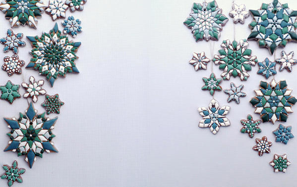
This striking duo of snowflakes was designed as part of our recent Practice Bakes Perfect Challenge #13 by the talented Rebecca Weld of The Cookie Architect, and it will be gracing our site until January 31, 2016 (lucky us!), when our February winner takes over.
Challenge #13smallBanner

As a reminder, each of our monthly winners will be featured in an in-depth Cookier Close-up interview on the site, and Rebecca is no exception! Her interview will post shortly after the New Year holiday, so stay tuned.

Also, if you missed Challenge #13, but would like your own cookie art to be considered for use on the site after our challenge winners have run their course, I would love to see it at any time. Guidelines for submitting cookie art can be found here.

Happy 2016!

Attachments

Images (2)
  • January Background: Cookies and Photo by The Cookie Architect
  • January Banner: Cookies and Photo by The Cookie Architect
Last edited by Julia M. Usher
Original Post

Replies sorted oldest to newest

the two pics here in your post are exceptional     love the look       it must be my eyesight    sorryyyyyyy   but i really like the banner      but    not sure about the background      maybe too faded ?         then again    as stated   it could be my eyesight    but    i really like the banner on the home page        bravo to you julia

donaharrisburg posted:

the two pics here in your post are exceptional     love the look       it must be my eyesight    sorryyyyyyy   but i really like the banner      but    not sure about the background      maybe too faded ?         then again    as stated   it could be my eyesight    but    i really like the banner on the home page        bravo to you julia

I don't deserve any kudos, as I simply uploaded the cookies created by The Cookie Architect. She gets all the credit!

I did have to lighten the background though (and may have to lighten future backgrounds as well), as it's hard to read the text on the site when the backgrounds are full/normal darkness.

Add Reply

Post
×
×
×
×
Link copied to your clipboard.
×