Hi, all! SURPRISE! It's me, Julia, not your usual lovely Christine. Since it's the holiday season and the time for giving, I wanted to give our hardworking contributors a crack at a challenge for a change. So, since most of them entered this time, I have flown solo through this recap, handpicking the featured entries without the usual input from the contributors team.
Before we get to our spotlighted artists, first, a big shout-out to all who entered! I know this challenge was a little more technically daunting than what we customarily do, but you all rose to the occasion with great finesse. Every one of the entries was site-worthy, making it EXTREMELY hard for me to pick. (Thank goodness I don't have to choose every time; I can't imagine being routinely in Christine's shoes!)
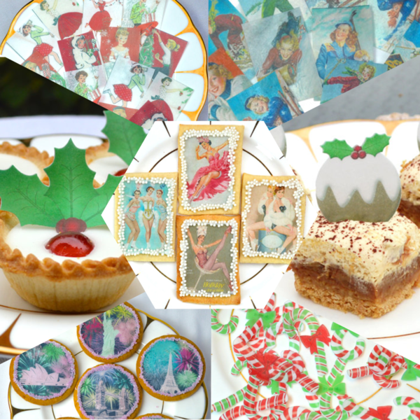
The prize contains:
- One set of Holly Leaves & Berries/Double Leaves (24 pieces)
- One set of Christmas Puddings (40 small pieces)
- One set of Christmas Candy Canes (40 small pieces)
- One set of Red & White Christmas from their Vintage 1950s Christmas Collection (16 pieces)
- One set of Fireworks Around the World (12 pieces)
- One set of Fun on the Slopes (16 pieces)
- One set of Show Time! from their Vintage Ice Skaters Collection (16 pieces)
And the randomly chosen winner of lucky Practice Bakes Perfect Challenge #13 is our lucky 13th entrant (what a coincidence!), Yankee Girl Yummies! More about her entry later, but congratulations on the win, Kari! We can't wait to see what you create with your new wafer paper loot!
Now, for the spotlighted entries . . . As I said, it was terrifically tough to pick, but since this challenge was really about "designing for a destination" (to borrow a phrase coined by Christine), I tended to favor those entries that gave greatest consideration to fitting cookies into the color palette and framework of our new site. So, without further ado, here we go . . .
January - Snowflakes are Like Diamonds by The Cookie Architect
Not only are these stunning snowflakes impeccably piped, but their icy color palette couldn't be better suited to the site and month. And talk about designing for the destination! Rebecca nailed this part of the challenge by anchoring cookies to the top and sides of the backdrop where they're most likely to be seen.
February - Fastelavn by Marie at LilleKageHus
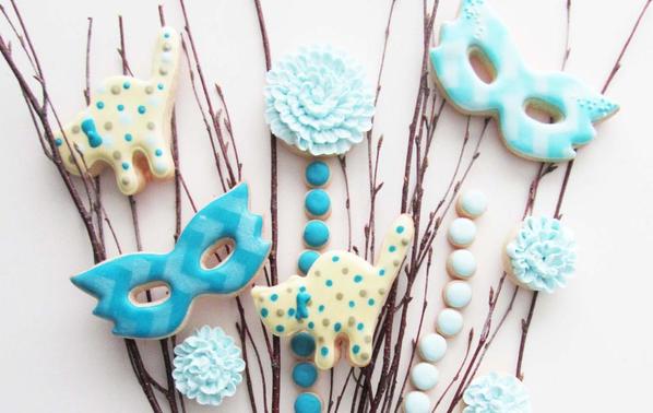
February was an especially difficult month to evaluate since we had a number of great entries, but Fastelavn ultimately tugged strongest on my heartstrings. Once again, the color choices are perfect for the site. But I also love how the masks peek out from behind the edges of the banner; the use of non-cookie elements to add visual interest; and how the cookies and sticks work together to tell a lesser known story about February. (Who knew Denmark had its own version of Carnival?! Not I!)
March - Timid Spring by Sweets_by_me

Au contraire, there are no shrinking violets here! In fact, it's the larger-than-life scale of this backdrop that really caught my eye. The interplay of the cookies with the needlepoint also adds just the right amount of complexity - enough to keep the eyes engaged without being overly distracting.
April - Flowers by Allegra Crea

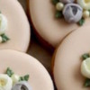
A fine example of how less can be more, these daisies, with their delicate detailing and subtle color variations, are going to look completely elegant on the site, I am sure!
May - Abstract Flowers and Birds by Bakerloo Station

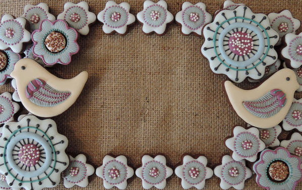
To echo what Liesbet said in her comment on this entry, "How many times can I click 'Like'?" I mean, who wouldn't fall in love with that adorable bird perched on the perimeter of the site! And, the colors?! Yeah, they speak for themselves - gorgeous!
June - June Bridal by emilybaking
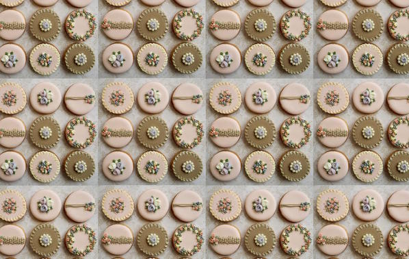
What could be more quintessentially "June" than a wedding cookie set? This entry not only hit the mark as far as a monthly theme, but I'm pretty sure Emily translated the site's exact hex color codes into icing! Emily also gets brownie points for being the first daring soul to enter this challenge, and for enthusiastically entering two more times!
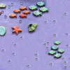
July - TIE: Hazy Shade of Summer by Laegwen and Under the Sea by Ryoko ~Cookie Ave.
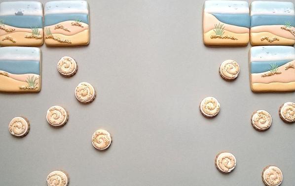
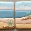
Try as I might, I just couldn't choose one winner for this month! Both of these entries were among my personal favorites, though for very different reasons. The soothing shades and soft undulating dunes in Laegwen's entry couldn't possibly evoke the long, lazy days of summer any more effectively. It's been a stressful week, but just looking at her cookies makes me feel like I've been on vacation for a month!


As for Ryoko ~Cookie Ave., she gets the prize for attention to detail! From the intricately piped coral reef and darling expression on the sea otter's face to the depth and dimension created by her meticulous cookie placement, she's created a veritable masterpiece. Just look at that banner - if I didn't know better, I could swear I was staring into a real aquarium!
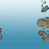
August - Deep Under the Sea by Magadiuz
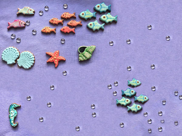
It goes without saying that those teeny schools of fish are super cute. But I also appreciate Magadiuz's keen eye for balance, both with respect to color and layout. She amped up the site's color palette just enough to convey the natural vibrancy of an underwater scene, but not so much as to overpower the site. And while many designers shy away from asymmetry for fear of imbalance, her clusters of fish, positioned at opposite corners of the backdrop, are the perfect visual complements to one another.
September - Vintage Lace and Button Samplers by mintlemonade
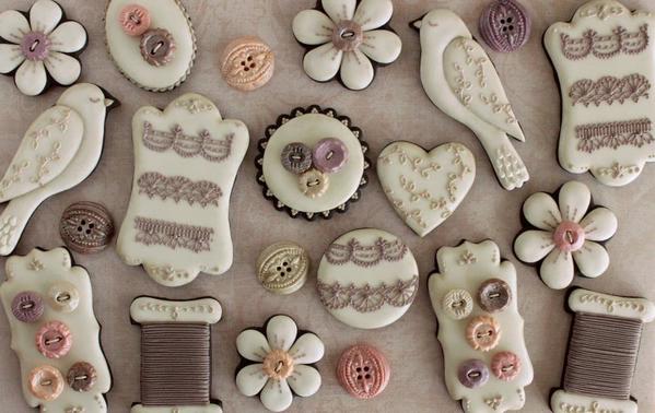
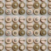
In a word, "exquisite"! The colors are dead-on, and the piping is sublime. I also like the use of negative space at the edges of the banner as a counterpoint to the cookie abundance in the backdrop.
October - Bountiful Harvest by virago
All I can say is: Thank goodness we didn't have an October entry, because it created room for me to recognize a second November set. Though originally designed with Thanksgiving in mind, this entry also fits an October harvest theme to a tee! Apart from its obvious seasonal suitability (say that three times fast), what I love most about this entry are its realism and yummy use of color. If these cookies weren't so darn beautiful, I'd gobble them up in no time flat.
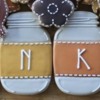
November - A November Fall by Yankee Girl Yummies
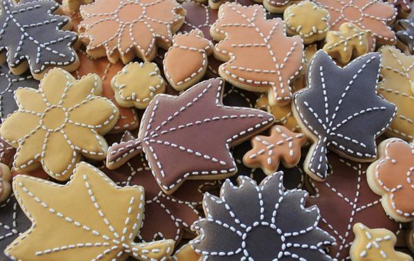
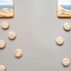
Yep, Kari was doubly lucky this time - in addition to winning a mother lode of wafer paper, she earned a monthly feature spot! Another great example of less is more, this simple carpet of leaves evokes autumn subtly but resplendently. Though the banner and backdrop contain very different cookie elements, they couldn't be cozier companions, thanks to the unifying color scheme and repetition of stitched detailing on the leaves and jars. And, of course, "THANKFUL" shouts Thanksgiving!
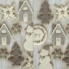
December - Grey and Pink Christmas Cookies by mintlemonade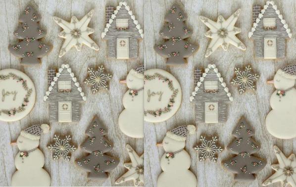
She does it again! As anyone who's acquainted with mintlemonade knows, she's a master of sophisticated color choices, and this entry is just another case in point. What's more, her banner scores big for its thoughtful design, which incorporates negative space to balance the action in the backdrop and strategically placed message cookies.
So that's a wrap! As a reminder, each of the featured entries will become the site's actual banner and backdrop during the month for which it was designed, and, better yet, the designer will be spotlighted in a feature interview later that same month. First up, Rebecca, aka The Cookie Architect, in the month of January! I can't wait! Oh, and one more treat: I was so enamored with all of the entries that I decided to open up a new clip set called "Site Submissions" so that members can contribute banners and backdrops whenever they'd like. I'd love to continue to feature cookies on the site after these features run their course at the end of 2016. For more information about making ongoing submissions, click here.
Again, congrats, everyone - and, winners, please remember to email me (sweetlife@juliausher.com) the original high res versions of both your banner and backdrop. I'll need those versions for uploading to the site.
One final word about the next challenge: Christine will be back as usual to reveal it on December 20, and I promise no pixels or aspect ratios will be anywhere in sight! ![]()

Note: Practice Bakes Perfect is a bimonthly Cookie Connection blog feature usually written by Christine Donnelly (Julia just filled in this month) that poses inspiration or challenges to get you to stretch as a cookie artist - for practice, for prizes, and for fun! Its content expresses the views of the author and not necessarily those of this site, its owners, its administrators, or its employees. Catch up on all of Christine's past Cookie Connection posts here.












Comments (19)