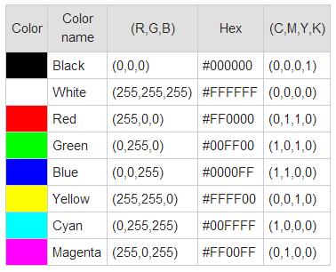
I'm having a horrible time getting the colors right printing on edible images. Reds are probably the worst, printing more like a coral color, rather than a true, deep red. And if I try to edit the picture, then it screws up the rest of the colors in the image by trying to get the red to print correctly. A friend mentioned that when she prints from a Word document - the colors are even worse. I've printed from word, PDF, jpeg, Corel Paint Shop, picasa and I think they are all equally horrible. Is it the ink? The paper (though I've used wafer and frosting sheets, both with the same outcome)? The printer? I got the Canon iP3600.
I guess it wouldn't be too bad if I was printing something like a logo that only had 2 colors - and I could edit the picture until it looked ok - but if I want to print a picture - forget it!! I spend hours (and multiple sheets of wasted frosting sheets) trying to get the color right. HELP!


