Hi, all! Another update on some site changes . . . As you hopefully know by now, our last site upgrade was the Reactions Release, which, about two months ago, replaced our liking feature for clips, blog posts, and other content with many, many more options for reacting. I love the added modes of expression that this release gave us, and I hope you do too!
However, in making the programming changes to accommodate that new feature, Crowdstack (the site tech support for Cookie Connection and Crowdstack's many other communities) eliminated our ability to like clips at the main Clips level (without opening up each clip) and the "likes" summary that appeared on top of each clip and blog post.
Since that initial release, I've been working with my personal computer support guy Jerry (who is awesome, BTW) to reinstate some of the above functionality that was lost. One thing to note: Cookie Connection rides a platform that is only partially open source-code, meaning that Jerry and I can only adapt a small portion of the code ourselves. Most of the code is under the control of Crowdstack, and, to make any custom changes through them, I usually have to pay an arm and a leg. Such was the case once again . . . to restore any of this functionality, I could only afford to work through Jerry on the code that he could access.
Long story short, after two months of work, we were NOT able to restore a "reacting" feature at the main clips level. So, for the foreseeable future (maybe forever), you will always have to open up a clip or a blog post and scroll to the bottom of it to react to it (i.e., like it, love it, or whatever). While we may see less overall reacting on the site due to this added step of opening posts, the silver lining is that we can be assured that all reactions are truly genuine, only given after people have thoroughly looked at or read your work! ![]()
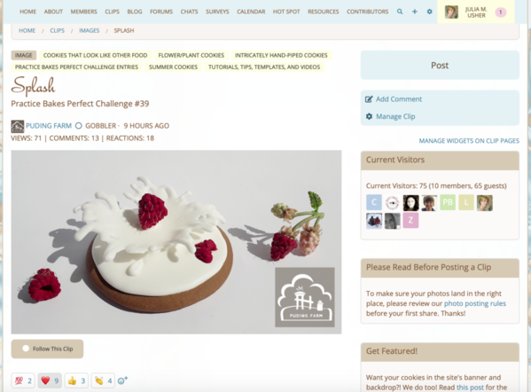
Now, for the GOOD news . . . we were able to move a "reactions" summary to the top of each clip and blog post, alongside the views and comments summaries that were previously there. Summaries on clips look like so, using @PUDING FARM's recent challenge entry as an example . . .
So, at this time of this screenshot, PUDING FARM's post had 71 views, 13 comments, and 18 reactions. The latter is simply the sum of all of the emojis that members had given the post to this point. They are listed underneath the photo, i.e., 2 "100"s, 9 hearts, 3 thumbs up, and 4 claps = 18 reactions. The beauty of this top-of-post summary is that it gives viewers an instant indication of the total activity on any given post.
On blog posts, the reactions summary appears in the same spot, at the top of the post under the creator's name. I've used Manu's recent tutorial as an example below, and you can see that it had 343 views, 19 comments, and 30 reactions at the time I took this screenshot:
The major difference with blog posts is that the emoji selection area will appear much further down your screen; you'll have to scroll a lot (perhaps several screen heights, depending on the blog post's length) to reach it. Again, see the example of Manu's blog post below:
But, please DO scroll. Cookie Connection blog posts are always worth the read! And I am sure our tutorial writers thrive on your positive emojis! ![]()
Now, I DID try to move this emoji selection area to the top of posts too, as a matter of convenience for you, but this was also not technically possible (within my budget).
So, that completes my latest site update! I wish I could have made more of my intended changes, but I hope you find the reactions summary enhancement a valuable one.


Comments (14)