As you may know from my recent forum post, I was as surprised as you all by yesterday's site upgrade. (Somehow the advance notices about it never made it to my inbox, or I would have warned you.) Anywho . . . since the upgrade, I've been running around, testing the various changes and figuring out which ones most impact you, so I could give you this update.
In short, lots of small (and a few big) things changed, but essentially only two changes really impact you. They are:
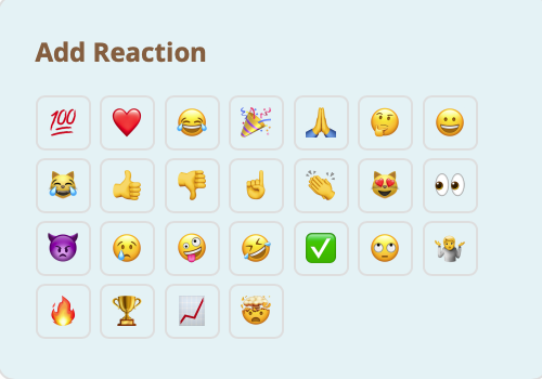
1. Reactions Replace Likes. In the past, you could like a clip, blog post, or forum post, but NOW you have a whole host of "reactions" from which to choose to express your sentiments about a photo or other content. Those reactions include:
So, where do you add likes and other reactions now? Simply look under the clip or forum/blog post (in the lower left) for a small blue smiley face icon with a plus sign next to it, like so . . .
Click on that icon, and the reactions will come up . . .
Then simply click on as many icons as you want to express your feelings about that photo or post. All reactions will get catalogued to the left of the smiley icon (for now, anyway). For instance, in the example above, the photo has received three hearts.
Hopefully, this addition will allow you to express yourselves more creatively, and to have a little more fun! Onto the second change . . .
2. New Comment Box Formatting. To accommodate the new reactions area, the comment box formatting changed in a number of ways. The reaction icons were added, of course, but, for some reason, all of my predetermined color settings also changed. I've reinstated some of the colors, but I'm still working on other changes that require more complex coding (and, thus, paid professional computer help!). These changes are purely cosmetic, so hopefully they won't throw you for too many loops.
While on the subject of changes . . . Depending on my computer guy's availability, it may be a few weeks before these changes can be made. But here's a heads-up on the refinements I am hoping to incorporate:
1. Move the "reactions" summary info (i.e., the three hearts, in the example above) from under photos to the top of them (near the number of views and comments), where the "likes" summary was positioned before. I think it makes more sense to have all of this "community response" information in one area.
2. Give the forum topic (primary post) a different background color than the comments that follow it. Right now, both topic and comments have the same background color, so it's a bit hard to differentiate the two.
3. Reorder the reaction icons, so more commonly used ones (like the thumbs-up) are closer to the top of the list.
That's all for now. Please let me know if you have any feedback or questions as you start to use the new reactions feature.
Thank you!




Comments (22)