Greetings from Chiberia! In case you are wondering what Chiberia looks like, it pretty much looks like this:
Realm of Snow and Ice by PUDING FARM
I am so over wintertime in Chicago, and yet we still have another two or three months left. (Maybe even four months . . . I did wear a down parka, gloves, hat, and blanket to a Cubs game in mid-June last year. Truth.) BUT, while I have been wallowing in my season of frozen discontent, all of your amazing challenge entries have warmed my heart (if not my fingers and toes). We had an incredible 54 entries this time around, and we judges struggled to narrow the highlighted entries to just 10. Know that even if your entry is not highlighted here, I did try to make substantive comments on everyone's individual entries. I also want to say that, overall, I could not have been more impressed with your work and excited that so many of you were inspired to try your hand at this challenge! I was especially thrilled to see so many first-time entrants, including several who were also first-time posters to Cookie Connection. I do hope we see you guys joining us for future challenges! [EDITOR'S NOTE: So do I!]
Before we get to those 10 spotlighted artists, let's talk about who is lucky enough to take home the prize for this challenge, a $150 SugarVeil® gift certificate, generously donated by none other than Michele Hester, owner and founder of SugarVeil®, the company that first created edible sugar lace and the silicone mats used to form that lace! Our lucky winner (who was chosen at random from among all of the entrants) can apply the gift certificate to her own choice of SugarVeil® products in their online store.
And the winner is . . . @talia! Talia's entry, this set of lovely ball gowns in eye-popping pink, was posted on the second-to-last day of the challenge (and I bet she is now glad she got this one in!).
Little Pink Dresses by talia
CONGRATULATIONS, @talia! I can't wait to see what you do with all of the SugarVeil® loot you buy with your gift certificate!
Now, on we go to the rest of our spotlighted artists, who are presented in no particular order . . .
Through the Eyes of a Bat by Elke Hoelzle In my eyes, this entry by @Elke Hoelzle is absolutely brilliant. The textures she created with her piped royal icing perfectly capture the look and feel of the interior of a dark cave. As one of our judges put it: "Elke's use of texture and negative space made this cookie so dramatic and convincing." Using the black fabric with the cutout in the middle ("negative space") is masterful photo staging, and really pulls this whole scene together. (For those of you who doubt that kicking up your photography game a notch would improve the look and presentation of your cookie art, look no further than this example.) I would have LOVED to have seen some pictures of the individual cookies of this set without the staging, just to see how this masterpiece came together.
Tick Tock, Tick Tock . . . Soon Midnight by Ryoko ~Cookie Ave.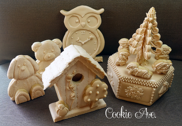 What an incredibly complicated project by @Ryoko ~Cookie Ave.! (And to fully appreciate the sheer effort and planning it took to accomplish this work of cookie art, I strongly encourage you to check out the first comment under this entry, where Ryoko offers a virtual tutorial on how she created everything.) Having seen the pictures of Ryoko's process, I cannot imagine how long this entry actually took to create. There are just so many different fabulous things going on here that it is difficult to unpack them all, but I will try . . . I love all of the wood texture (created by applying royal icing with a paint brush). I was amazed by the detail Ryoko was able to fit on those tiny dwarfs (they are 2 centimeters, or less than an inch, tall!). The smoothness of the icing on the clock is such a marvelous contrast to the texture of the teddy bears. The pieces of the 3-D elements fit together perfectly. I am a sucker for a fantasy flower, and I love every one of her floral designs. (You can see close-ups of the floral panels also in the first comment to this entry.) Finally, the tree on top of the box is so unique, and the process for making it (hint: it's many, many royal icing transfers "glued" together) was either genius or insane. Do take a look, and let me know what you all think! This is a magnificent entry. Brava!
The Old Blacksmith's Home by PUDING FARM Take a good look at this entry because there is some truly masterful piping here. (You can see more detailed close-up pictures in the first comment to this entry.) With the exception of the bell cookie, most of the piped details are royal icing transfers. If you look closely, you will see the perfectly distressed, pitted texture that PUDING FARM achieved with her royal icing, making it look like real antique metal work. She tells me this is due to her use of "active carbon powder," which I personally have no experience with, so I will definitely look into that for my projects in the future (and if @PUDING FARM wants to give us a few pointers on how she worked with the powder, I would be all ears!). Furthermore, I thought it was super creative to turn over the rooster transfer to create a different texture and almost color, which PUDING FARM tells us was done to create the illusion that the rooster had spun to its backside due to the wind! Genius.
Botanical Plants by Anna Dziedzic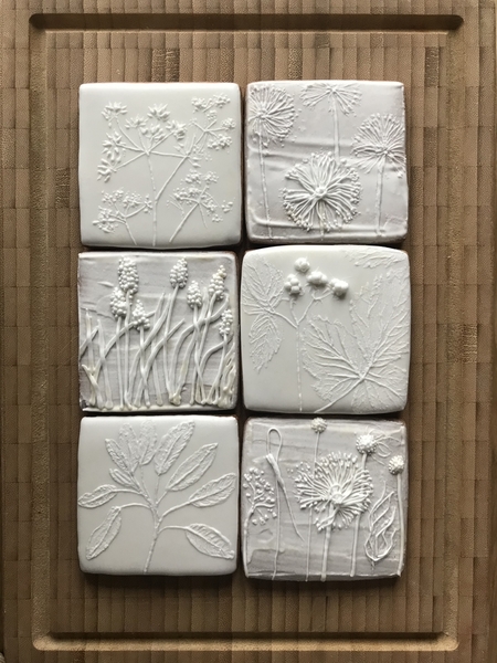
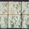
These botanicals are so realistic that I thought they were created by pressing real leaves into wet royal icing! But no, they were actually done by painting with royal icing onto a flooded, completely dry cookie. Again, Anna has provided us with fabulous close-up photos of these cookies in the first comment to her entry. Please take a look, because you can't really appreciate the true beauty, depth, and texture of these cookies until you see all of the tiny-tiny details.
Snow Rabbit Valentine by swissophie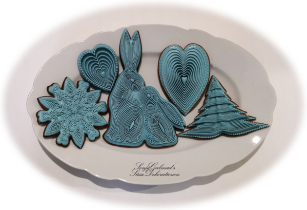 Raise your hand if you thought, at first glance, that this set of cookies was made by quilling wafer paper? Well, that's what I thought, until I read Sonja's description of how she carefully, painstakingly stacked multiple piped lines, one atop the other, to create the amount of depth you see in her concentric lines. And it is that depth that creates the deep shadows that make this look like quilling. Clearly, Sonja has been gifted with both a steady hand and the decorating patience of a saint!
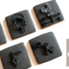
Terracotta Pottery Artifacts by PUDING FARM When I saw these, especially in this photo with the natural sunlight shining so brightly on them, I instantly thought of Sicily and Greece, and all sorts of heritage sites along the Mediterranean. I love the contrast between the slightly shiny, smooth icing used for the jugs and the rough, thick icing spread in the background. And this color is so spot-on that, if one of the food gel companies created it, it would have to be called "Terracotta"!
"Let Me Call You Sweetheart" by Cookies Fantastique by Carol There are so many lovely things about this entry. First, I love how Carol pulled inspiration and techniques from so many different people here at Cookie Connection, while at the same time really making this set her own. That is what inspiration is all about! As a set, this combination of cookie designs in this lovely pale ivory works so very well. The large rose is absolutely stunning, and I was shocked to hear that Carol created it by piping royal icing petals on top of a molded rose cookie! It seemed like such a complicated technique to me when I first read Carol's description, but, really, it would have been extremely difficult to get such a large, intricate rose to work out any other way. With this set, Carol may be paying back a little of that inspiration!
Monochrome Aquarium Puzzle by Kanch J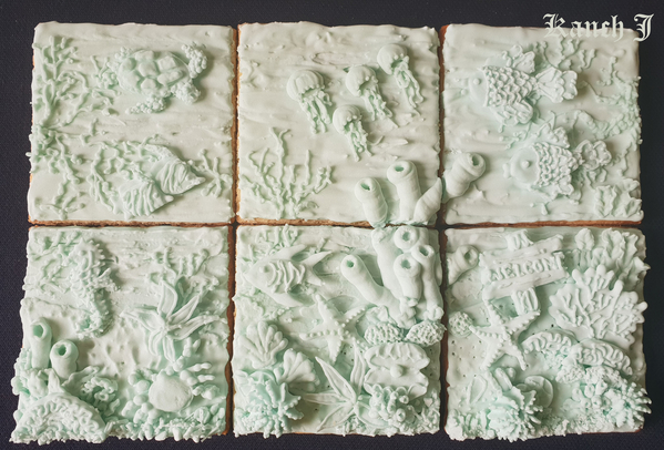 Full of "depth, dimension, and 'life,'" as one of our judges exclaimed, this set by @Kanch J hit all the marks for this challenge. First, this set has one of the most impactful color choices of any of the challenge entries. The use of this almost fluorescent pale blue-green really conveys a sense of the mysterious deep sea. The amount of depth that Kanch J was able to achieve through the combined use of both royal icing transfers and direct piping is impressive. The shadows created by the lighting really enhance the depth of this piece. The level of detail exhibited here is admirable, and I encourage everyone to click on the photo to take a closer look.
Always Bee Yourself by RebeccArchitect
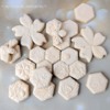
I know it was it successful challenge when among the entrants there is everyone from first-time Cookie Connection posters to the former Practice Bakes Perfect host! This array by former Practice Bakes Perfect host, The Cookie Architect (aka @RebeccArchitect), is a study in how expert design trumps everything. As one judge put it: "Sometimes we are drawn to a set of cookies at a glance without knowing the reason," but, upon closer look, you start seeing all of the many reasons. For instance, this set is masterfully designed so that the hexagon shapes of the cookies are echoed in the honeycomb stenciling and piping. Even the chosen color is smooth and creamy, like honey. The whimsical feel of the whole array, which Rebecca pulls off so effortlessly, is really accomplished through a keen eye for design.
Butterflies in Secret Garden by The Tailored Cookie The shadows cast by the sunlight hitting the butterfly wings in this entry create such beautiful shadows and interesting tonal variations that @Julia M. Usher and I were not sure if the set was created with just one color of icing (indeed, it was). Looking at this entry is like taking a peek into a butterfly conservatory on a moonlit night. Great color choice here.
As you have probably gathered from some of my comments, the role that lighting plays when presenting or photographing monochrome cookies is critical. As we pointed out in the original challenge description, one really needs to "catch the light" in order to make a single-color design stand out.
And with that final note, Practice Bakes Perfect Challenge #32 comes to a close. Thanks again to Michele Hester of @SugarVeil for her generous prize donation. I hope you will join us for our next challenge, which will post on or near March 3, 2019.

 Christine Donnelly began her professional baking career at 16, when she was hired on the spot at her local bakery to work the counter and decorate cakes. After detours to college and law school, she worked as a trial lawyer in Chicago for many years, ultimately leaving that career to become a stay-at-home mother to her two children. In her “retirement,” she continued to bake at home, at last finding her preferred artistic medium in decorated cookies. In February 2013, Bakerloo Station was born with a presence on both Facebook and Instagram. Christine makes cookies to balance her left brain, to inspire and share creative ideas, and to feed those needs that only art can satisfy.
Photo credit: Christine Donnelly
Note: Practice Bakes Perfect is a bimonthly Cookie Connection blog feature written by Christine Donnelly that poses inspiration or challenges to get you to stretch as a cookie artist - for practice, for prizes, and for fun! Its content expresses the views of the author and not necessarily those of this site, its owners, its administrators, or its employees. Catch up on all of Christine's past Cookie Connection posts here.






Comments (31)